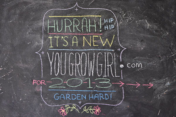
Ladies and gentlemen, children of all ages: please refresh your browsers. I am pleased to report that the site has been redesigned! All of the praise goes directly to Davin Risk who is wholly responsible for the work that has been done so far, including the gorgeous illustrations and hand drawn type.
In the coming weeks we will be making many more changes to the site, some that you will notice (the archives are temporarily unavailable but will be rebuilt shortly) and others that will improve use of the site but will be largely unseen.
Until then, here are some of the changes that have occurred so far:
- Look and feel.
- Larger font sizes and overall improved readability.
- The typefaces used are now coordinated with those that are used in most of my books. In case you care they are Sentinel and Whitney.
- Larger photos: I have been using larger images for some time in anticipation of the redesign so it’s nice to see the larger images working within the proper context.
- There is a pared down and responsive mobile version to make reading on cellphones faster and easier.
- A list of Resource Guides now appear in the right hand column. I will be continuing to add more guides as well as fine tune the section.
- Posts that are popular right now (mainly new or seasonally relevant) appear on the right hand side.
- Helpful pages such as the glossary and a huge list of garden tips that date back to the early days of the site (over a decade now) are also available in the sidebar.
UPDATE: And now more noticeable site changes (as of August 30):
- Bread crumbs located at the top of each post help to better orient you within the site.
- An updated archive.
- Font sizes increased.
- Improved site search.
- Social media buttons are back at the top of the right side column.
- Content wide restructuring has taken place and a few top-of-the-site categories have changed (i.e Eat, Dream, and Create). This should make it easier to find projects and older articles, especially recipes.
Looking great!
My eye went zooming into the orange lettered headline.
I love orange in the garden… Tithonia, Butterflyweed, Zinnias, Dahlias…
It’s an attention-grabber.
Looking forward to navigating the new turf.
Love it!
By far, my favourite is that you’re incorporating so much hand-lettering and so many drawings. As an illustrator of all things in front of me, I just can’t get enough of sketches.
Oooh it’s lovely! Great job. I sense your joy and it’s wonderful.
It looks great! Nice and clean, easy to read. Good job on all of the hard work.
Congrats, it looks great! The font sizes could be still a bit larger.
Done.
Congratulations to both of you. It looks lovely. What a huge amount of work.
With great results.
Looks lovely!
I love it!
Beautiful!
Gayla, it’s gorgeous! I’m smitten with your new header. Davin definitely deserves some sweet garden treats for the beautiful new design!
I love the new hand drawn design!!!
Gorgeous! Love the fresh new look! It’s like being invited to tea in your garden. (Because I always drink tea when I visit your blog…) :)
Very nice! I love it!
I love what you’ve done…So nice and easy to read!